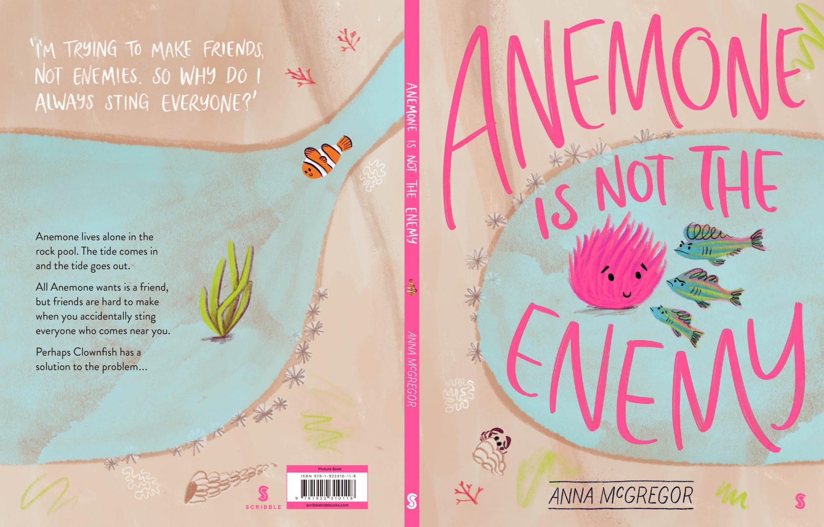
Anemone Is Not The Enemy
This book is like a play, the scene is mostly unchanging and the wholey dialogue text is attributed graphically with hand-drawn lines. Because we read left to right, the challenge was to indicate the order of the text clearly to the reader. The secondary story running throughout the book differentiates in a smaller, san-serif font. On page 32, we laid out non-fiction facts for curious readers. The neon Pantone is used with restraint, drawing attention to Anemone on the verso, until the sting pages deliver the visual shock of neon sting lines en masse. All feature text is hand-lettered.